Modern Website Design, To Scroll or Not to Scroll

No Scrolling Please...
“And don’t forget…no scrolling. Everything has to be above the fold. I want everything where people can see it. I just don’t want to take the chance that they might miss something.”
-Every Client We've Ever Had
Fun Fact: the term “the fold” came from the way newspapers were displayed out on the street, with all the headlines in view to entice passersby’s to pick up the paper. If it looked interesting enough, people might pick up the paper and buy it.
To this day, we still have clients trying to cram 8lbs of crap into a 5lb bag.
The reality is, that back in the day there actually was a certain degree of logic to this. By “back in the day” I mean around 2014 or earlier. I know this because back in the day, that’s how we built websites.
So What’s Changed?
In a word; “mobile”. Mobile changed everything. It wasn’t long after Google announced that there were now more searches on mobile devices than desktop computers in May of 2015, that web designers started shifting to designing for mobile first, with desktop just falling into place.
Apple didn’t invent the touchscreen, but they innovated it. In essence changing the way people interact with mobile devices, and by proxy,
re-training the way we interact with full-sized desktop websites. Yes,
“re-training”.
We were originally trained to consume a website much like we did a newspaper; with headlines above the fold, different stories simultaneously in view, “linking” to page 32 to finish the article.
Mobile devices have now re-trained us to consume websites in a linear fashion. One headline at a time as we scroll and scan with our fingers to the next section of the page. Less text and more headlines that link to additional information. It’s the way we navigate now.
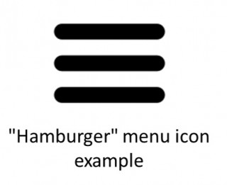
It’s just easier and faster to scroll with your finger or mouse than it is to click to another page and wait for it to load. Designers often hide the navigation behind the much debated “Hamburger” (those 3 parallel lines that look like the side view of a hamburger).
QuickTip: To see if a website is “responsive” (resizes itself according to the size of the device it’s being viewed on) without viewing it on a smartphone, just grab the edge of your browser window, and slowly pull it in. You should see the various elements of the website move around and realign themselves to compensate for the reduced screen size.
Thou Shall Not Scroll
I never bought into the “scrolling is a sin” concept, as long as the enticing points of a website were above the fold. Modern website design is cleaner, and if properly planned out, provides a user experience that leads the visitor to a very specific “call to action”.
Case in point; last year we experienced a 184% increase in phone calls alone for this Glass & Mirror Company simply by modernizing our original 2011 design to accommodate a good mobile experience. We didn’t do anything different with our search engine and social media strategies, just upgraded the design.
Get With the Program
Take your 2011 goggles off, and take a critical look at your website through the eyes of today’s consumer, and how they consume media. How does your website stack up against your competitors, and against other industry leading websites? How does it look on your smartphone?
Here are a few examples from our portfolio, but there’s no shortage of good examples of modern web design out
there. Design trends is a pet project of mine, so if you like, I’ll personally review your website and make suggestions. Click the button
below and I’ll be in touch. I personally respond to each and every message.